Project Overview
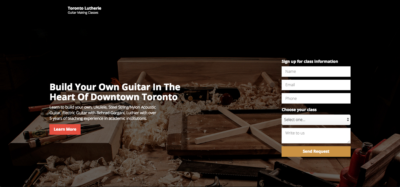
Toronto Luterie is a side project of mine, a weekend woodworking program focusing on the design and construction of musical instruments. Ever since Canadian School of Lutherie in Toronto closed down a number of years ago, there has been a need to fill their gap in the market. Currently the existing competition offers weeks long full time programs requiring the students to either spend time in the suburbs of Toronto or travel to other provinces. Toronto Lutherie is designed to serve those who cannot spend five weeks in Quebec, Alberta, orBritish Colombia. The studio is a five thousand square feet space fully equipped with industrial grade machines within walking distance from a major subway station. The school is set up in such a way to allow students to spend six to ten hours each weekend for a period of three to four months to build an instrument from scratch.
Google Trends For Guitar Making
Project Summary
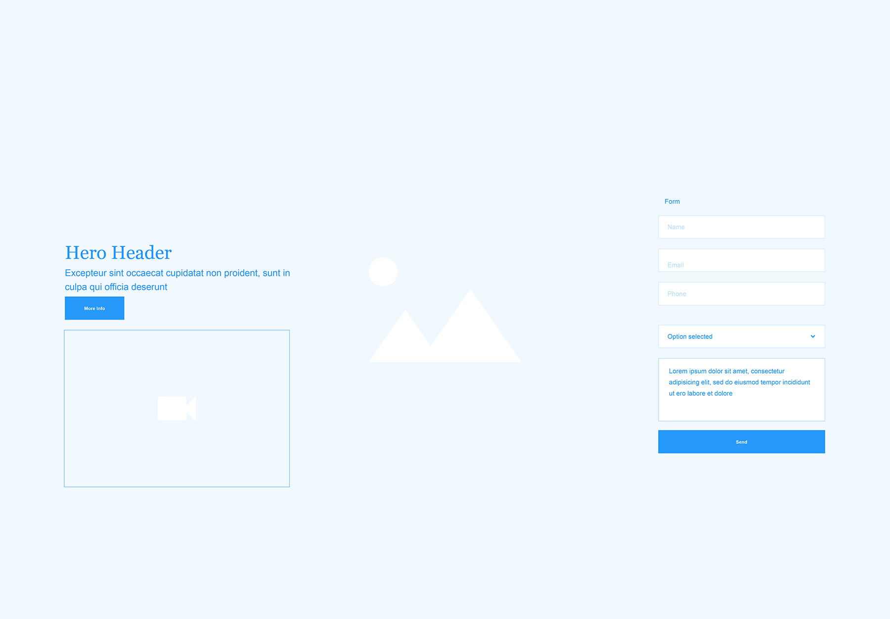
The project required a landing page for marketing and lead generation. This page would be different from a typical home page. Once the school is established and people know about the presence of such program and facility, I would switch from the landing page to a multi page website with more features.
The core requirements for the page are:
- Allow users to sign up for their chosen course with a simple input form
- List courses and prices
- Get to know the person/people behind the school
- Be able to read testimonials from past students
- Be able to see images and videos of past work
- Have a map of the general location of the shop
Business Goals
- Become a established part time woodworking school in Toronto
- Appeal to different age groups
- Create an educational community for music enthusiasts
- Invite other professional woodworkers and musicians to teach seminars and classes
Measures of Success
- Generate leads, 4 inquiries per week
- Generate revenue, 2-3 students per month
- Get noticed by music stores, and music related festivals
- Get interviewed/ published in a reputable local blog or publication
User Personas
David Ramsey

- Age: 63
- Occupation: Electrical engineer at SNC–Lavalin
- Income: 130K
- Hobbies: weekend woodworker, building his own furniture.
- Priorities: Part time class schedule, professional instructions, quality results
- Motivations: Get together with friends for coffee, learn more about fine woodworking.
Jamie Daniels
- Age: 37
- Occupation: High school art teacher, part time musician
- Income: 70K
- Habits: Playing music semi professionally at local venues, fixing her own instruments
- Priorities: Part time class schedule, quality results, learn to work on her own projects in the future
- Motivations: Hangout with friends, play the guitar, go to concerts
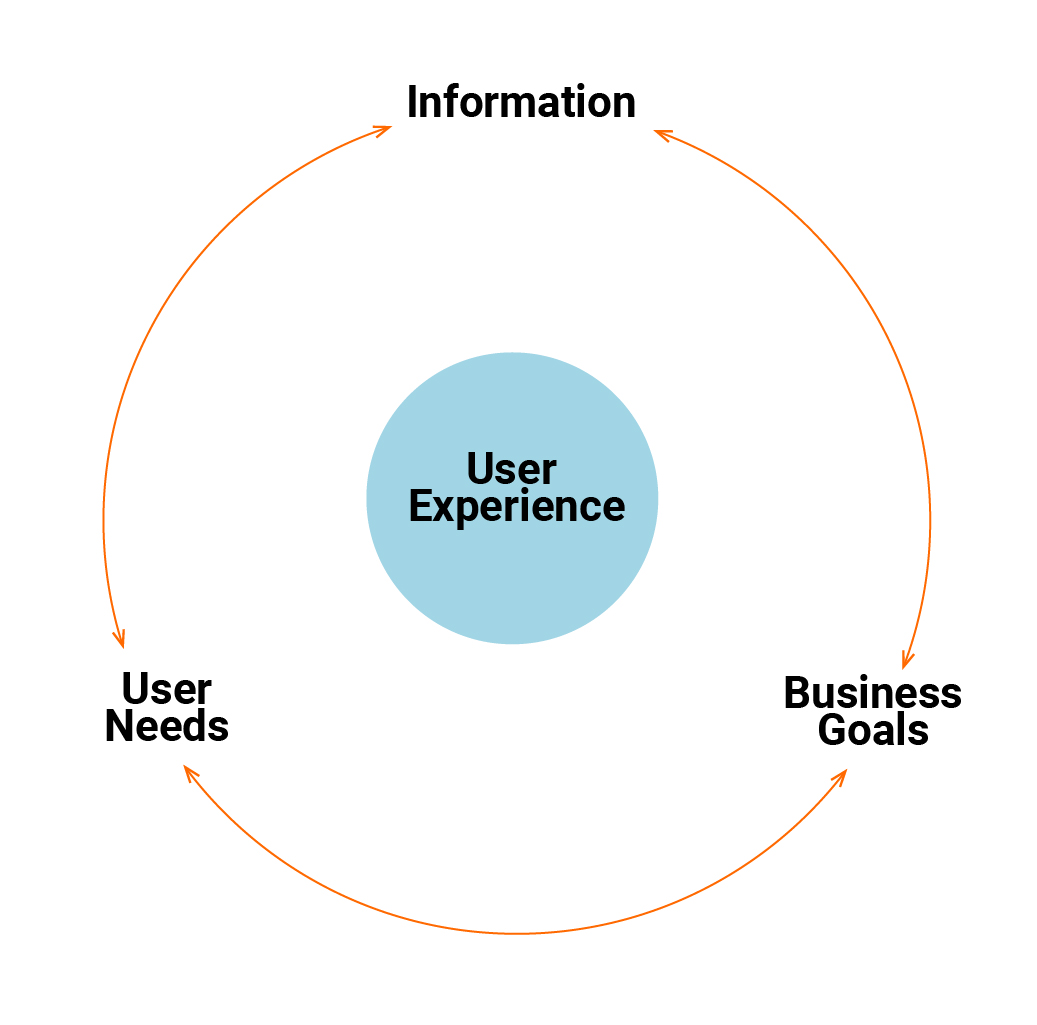
My UX process for designing a high–conversion landing page
Layout
Less is more. In designing a landing page it’s important to filter the information multiple times, only keeping the relevant elements. This will improve the visitor’s focus and increase lead generation.
Single page design
Avoiding distraction is another important strategy. In designing a landing page it is essential to communicate the message in a simple yet engaging manner. Navigation pages, and external links, would take a visitor’s attention away from interacting with the page.
Call to action
Having a clear focus with a single purpose call to action is vital to successful lead generation.
Copywriting
Information hierarchy is a fundamental strategy. Presenting only what is absolutely required in short snackable sections is key to maintaining the visitor's attention.
Submit form
Forms should be minimal, only requiring the key information. Upon submitting the form,users should receive a confirmation message either on the site, or emailed to them.
Typography and colour scheme
Colour and type are essential elements of any design project. Proper use of type is crucial for creating information hierarchy.Use of multiple typefaces of varying weights and styles should be avoided as much as possible. An effective two–tone colour scheme is often more successful,this helps to create a visual identity.